Porsche Model Overview
The Porsche Car Configurator enables users to individually configure their dream vehicle from model, color, and wheels to interior and special features, all in an interactive real-time preview.
Year
2023
Client
Porsche AG
Website
https://configurator.porsche.com/de-DE/model-start/

Porsche Car Configurator
The Porsche Car Configurator enables users to individually configure their dream vehicle from model, color, and wheels to interior and special features, all in an interactive real-time preview.
My Role
UI / UX Designer
Duration
6 Months
Team
2 Designers (Team Decide)
2 Product Managers
5 Frontend Developers
Opportunity for a Revamp
The Porsche Car Configurator was redesigned because the old version no longer fully met the needs of today’s users – especially on mobile devices. With the new design system (Version 3), there was a chance to make everything clearer, more modern, and more user-friendly.
The new design is deliberately simple and uncluttered so that users can navigate it more easily and configure their car step by step without hassle.
The redesign was based on user feedback and helped address usability weaknesses. At the same time, we were able to use the new design system (V3). We saw this as a great opportunity to fundamentally overhaul the configurator.

Problems encountered during user research
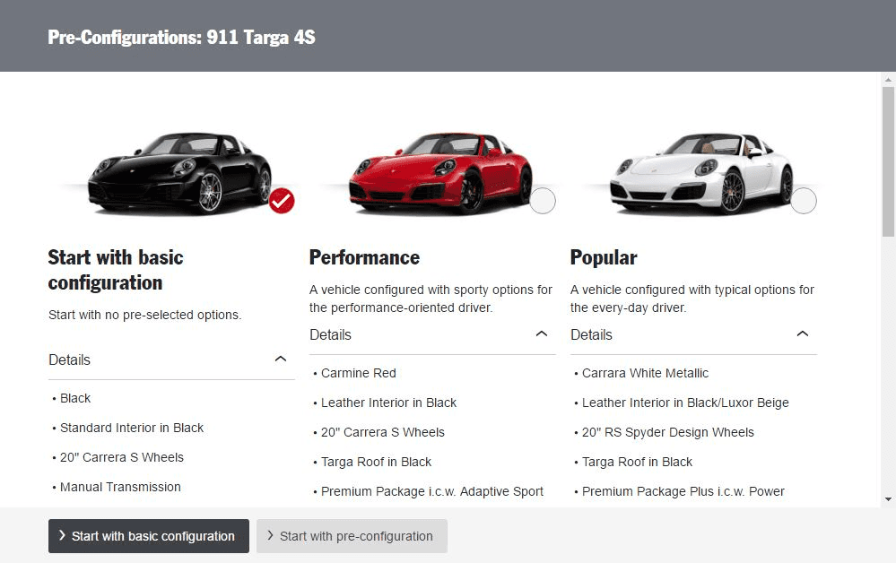
Missing information about the models
In the old view, only images and model names were shown, without technical details, prices, or special features.
Impact: Especially new or less experienced users had difficulties categorizing or comparing the models.
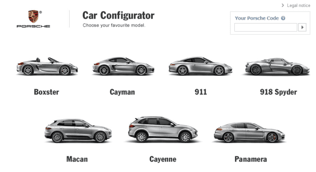
Visual overload due to unstructured layout
The old version displayed all models equally side by side, without clear structure or visual guidance.
Impact: Users quickly felt overwhelmed and didn’t know where to start.
No clear call to action
(CTA)
There was no clear button to start the configuration, users had to click on the model without knowing what would happen.
Impact: Uncertainty about the next step and extra cognitive effort.
Old Version
How can we solve the problems?
Missing information about the models
Solution: Provide all important vehicle information directly in the overview, so users can make informed decisions without an extra click.
Visual overload due to unstructured layout
Solution: Organize content into clear, visually separated cards to make orientation easier and reduce cognitive load.
No clear call to action
(CTA)
Solution: Add clearly recognizable “Configure” buttons that clearly communicate the next step and simplify the entry into the configuration process.
Some results from the research
Important information (such as price, features) was missing, making it hard to compare models directly.
There was no clear CTA indicating how to begin the configuration.
Returning users could not find a clear CTA to load their previous configuration.


Design Principles
Create Orientation
Design the user interface so that users can immediately understand what models are available, how they differ, and what the next step is.
Make Information Visible
Important details like price, vehicle type, and features should be presented early and clearly to allow quick comparisons and decisions.
Simplify Returning Visits
Ensure returning users can pick up where they left off, with easy access to saved configurations and personalized entry points.
Orientation
Visibility
Continuity
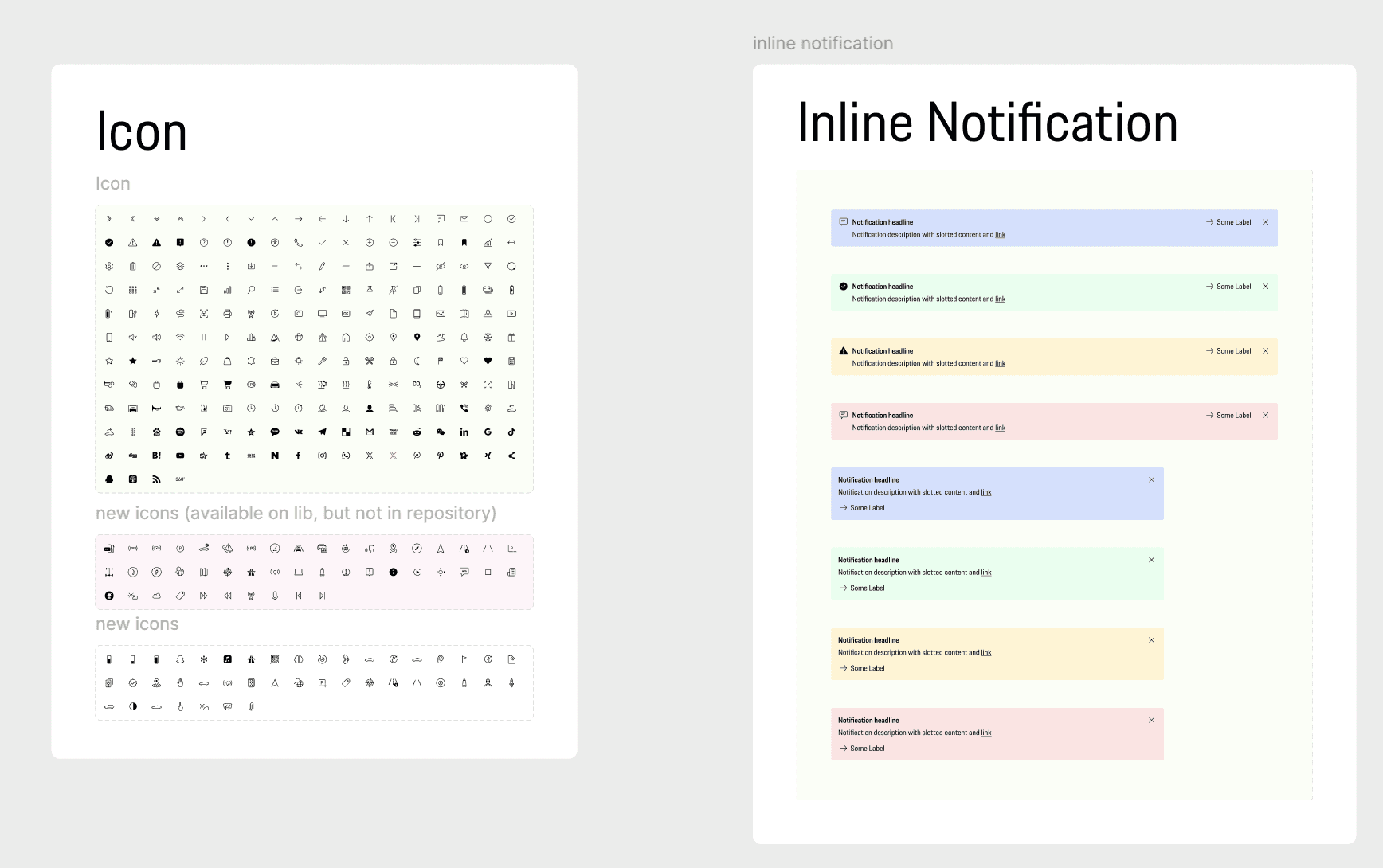
Design System

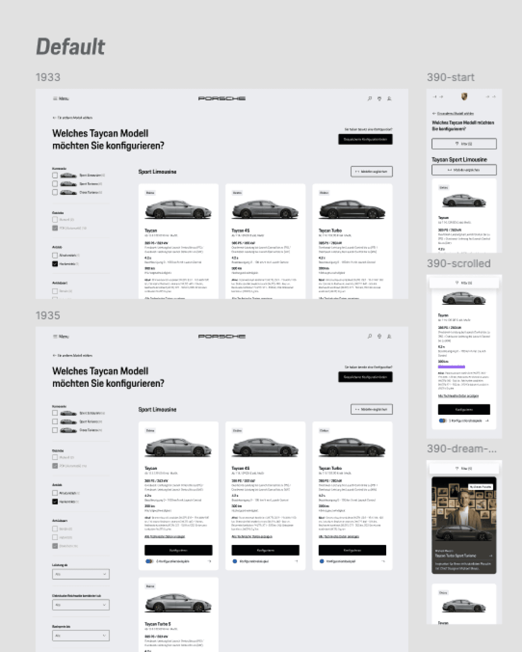
Reiterations
We designed and iteratively tested different versions of the model overview page. User feedback showed us which information is important and what can be omitted. The final version was shaped by these insights and delivers a clearly structured, user-centered design.
Hand-off
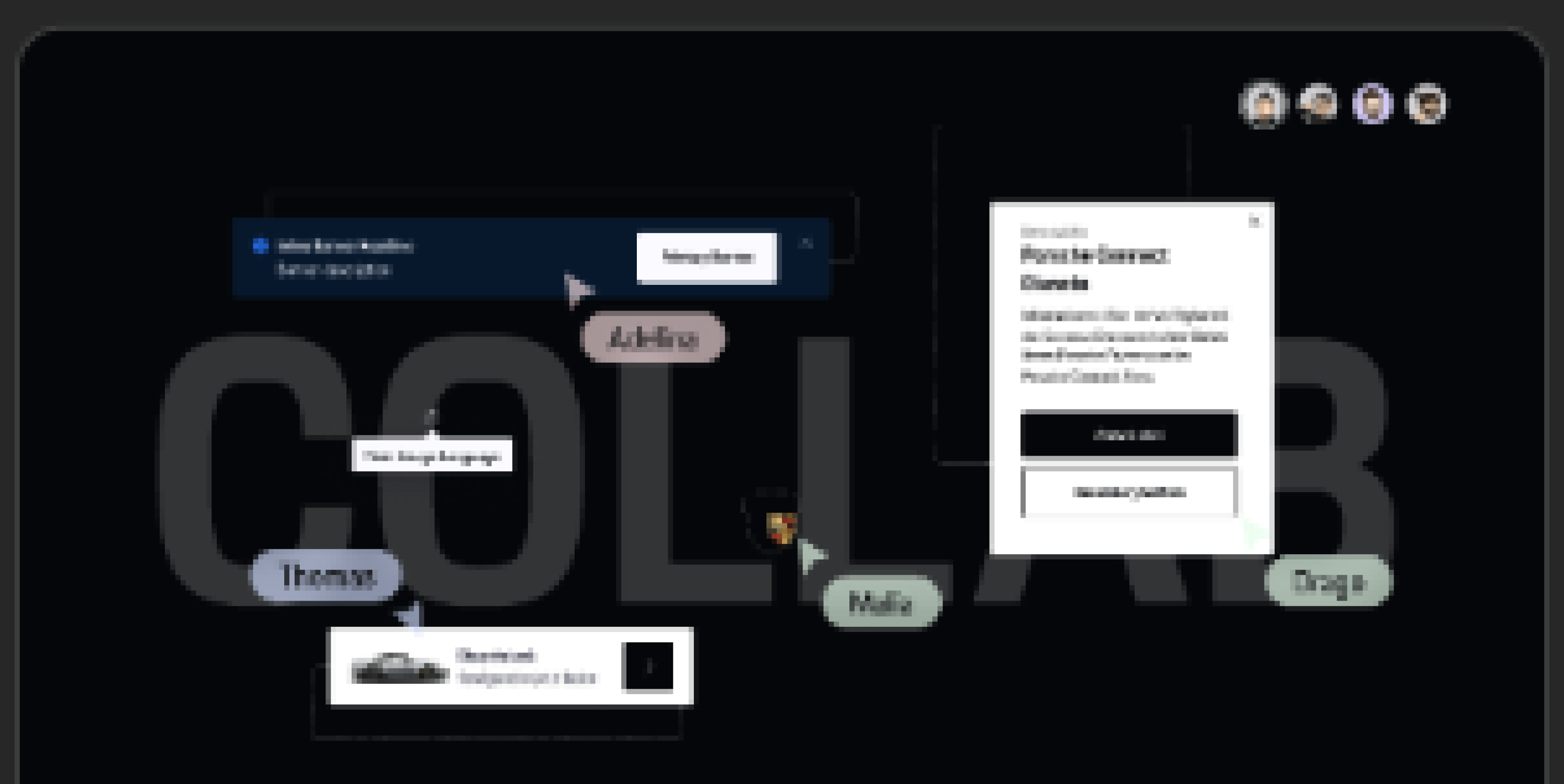
To ensure a seamless transition from design to development, I documented all designs directly in Figma, using comments and clear annotations to explain functionality and layout decisions. I also organized all necessary assets into a dedicated handoff file and attached it to the relevant Jira tickets, so the development team could start implementation immediately.
Throughout the process, I used visual indicators in Figma to show which sections were final and ready for development versus those still in progress. This helped the dev team stay aligned with the current design status and reduced the risk of misunderstandings.
Throughout the process, I used visual indicators in Figma to show which sections were final and ready for development versus those still in progress. This helped the dev team stay aligned with the current design status and reduced the risk of misunderstandings.
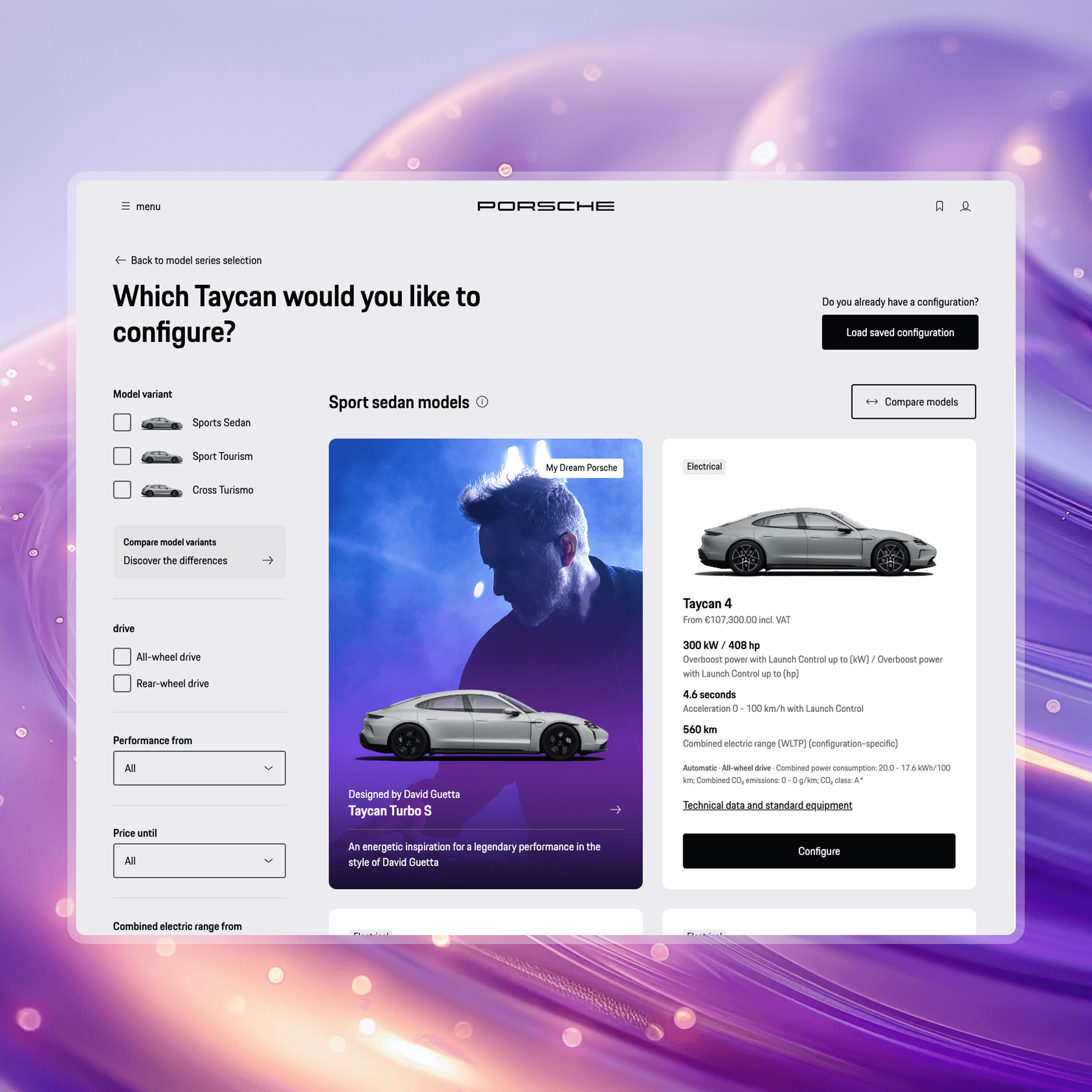
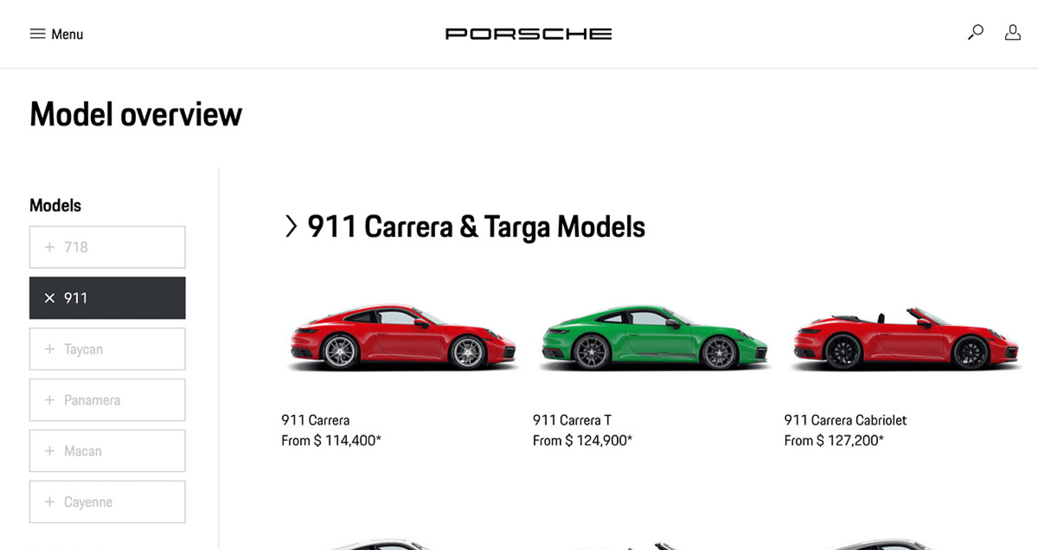
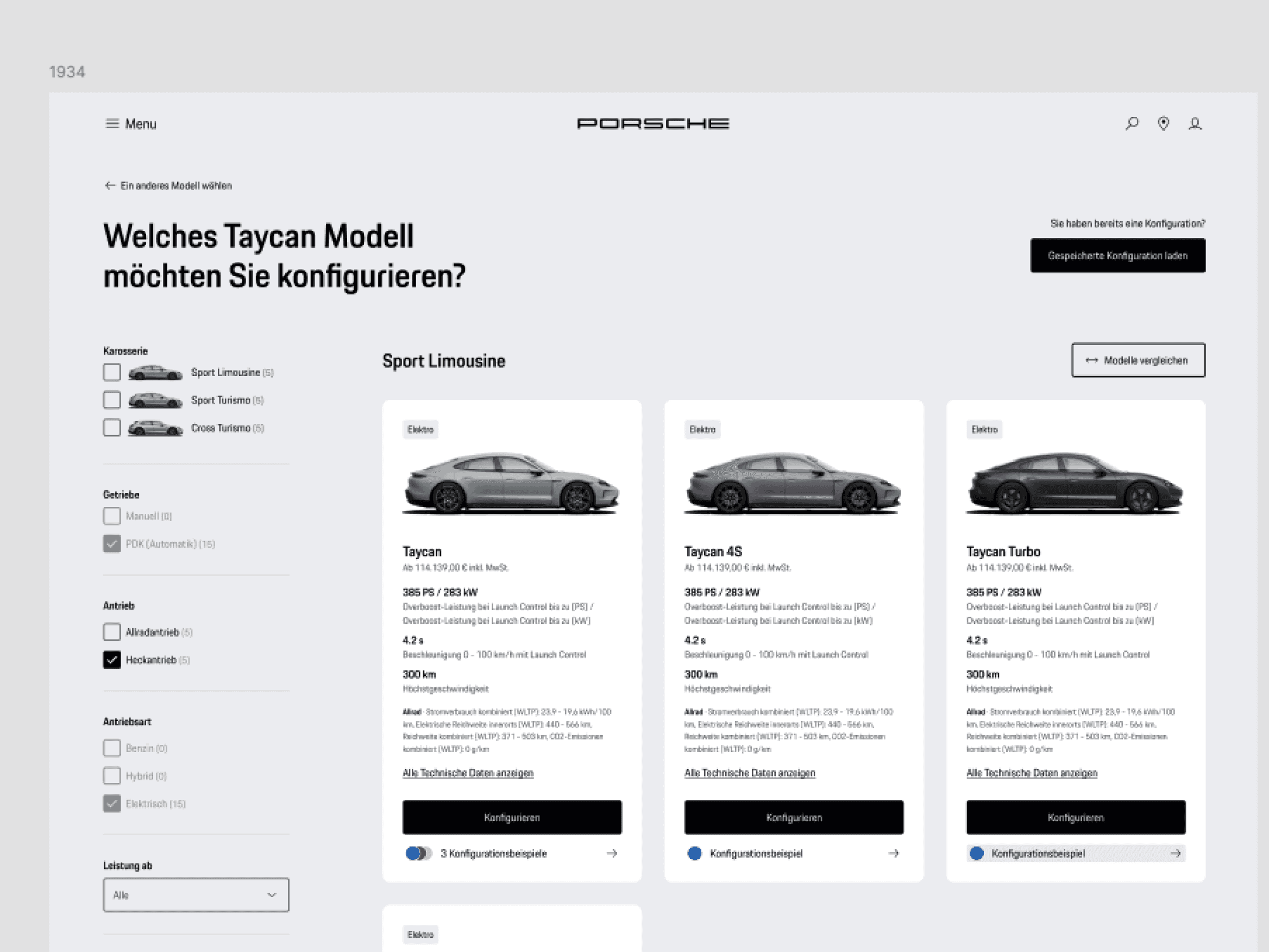
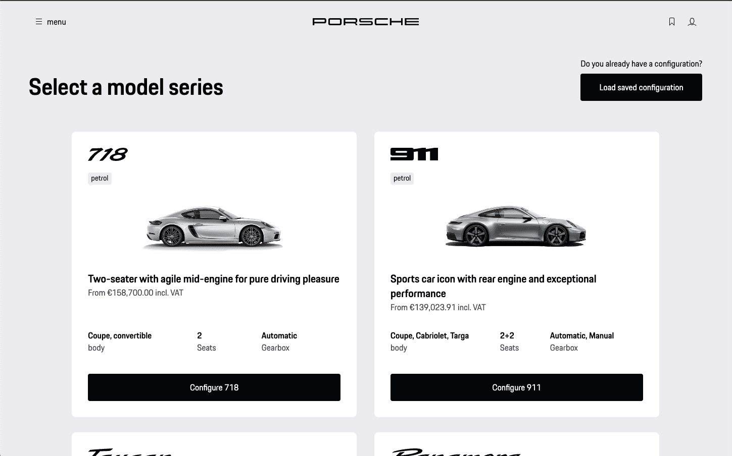
Creating Orientation
To help users confidently navigate and compare models, we redesigned the model overview with a clear, card-based layout that displays key specifications and pricing at a glance. Each card offers enough context for users to evaluate the differences between models without needing to click deeper.
Prominent “Configure” buttons provide an intuitive next step, while a “Load saved configuration” option supports returning users by allowing them to pick up where they left off. This improves both continuity and personalization.
To enhance engagement and exploration, we introduced an interactive hover effect: when users hover over a car image, it smoothly rotates to reveal different angles of the vehicle. This subtle micro-interaction adds depth to the browsing experience and supports visual decision-making.
A clean visual hierarchy and thoughtful spacing further reduce cognitive load, making the model selection process faster and more user-friendly.
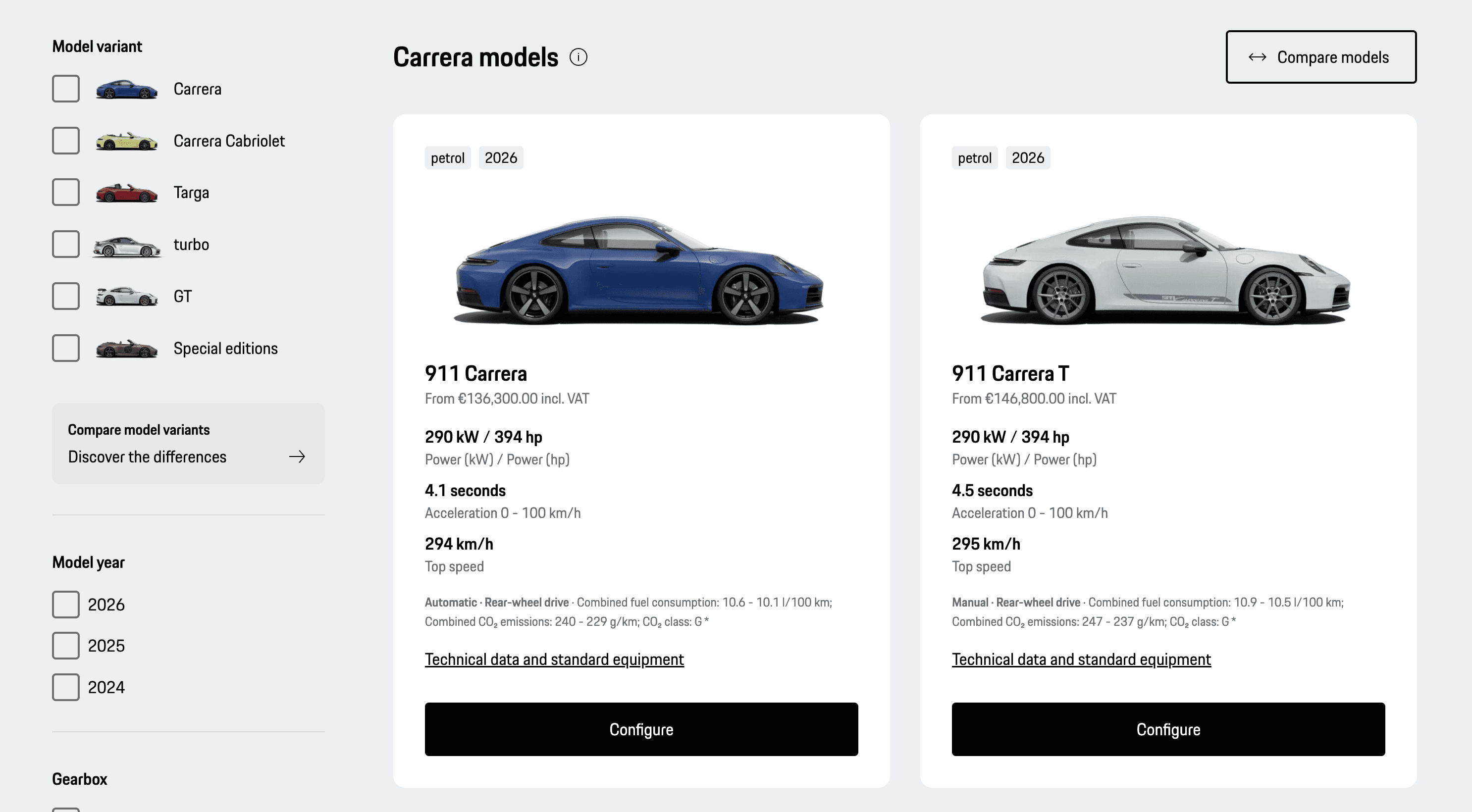
Clarity and Guidance When Choosing the Right Model
The updated model overview for the 911 series simplifies comparison through detailed cards that highlight performance specs and pricing. A clean layout improves scanability, while visual filters allow users to quickly narrow down models by variant, year, or gearbox.
To support more confident decision-making, users can access technical data directly from the model card or launch a side-by-side comparison. This structure empowers both first-time and returning users to make informed choices without friction.
Combined with the rotating car previews on hover, this section turns what used to be a dense, overwhelming list into a clear and intuitive exploration tool.
Business Impact
Higher Completion Rate Through Better Orientation
The improved overview and comparability help users make faster and more confident decisions, reducing drop-offs and increasing the number of completed configurations.
Enhanced Brand Perception
The clean, high-end interface reflects Porsche’s premium brand values and delivers a digital experience that aligns with the quality of its vehicles.
Stronger User Retention & Return Visits
Features like saved configurations and targeted filters for model variants deepen user engagement, boosting the likelihood of return visits and improving long-term conversion potential.