Refactoring the button component
A behind-the-scenes look at how I reduced Edifire UI's button component from 432 variants to just 32 using parametric logic, slot-based design, and Figma properties. This case study explores the thinking, tooling, and cleanup strategy behind a scalable, token-driven system built solo and made for open source.
How i reduced my button variants from 432 to 32 in My Solo Design System - Edifire UI
When I started building Edifire, a personal design system built from the ground up with a vision to become open source, I thought I was being thorough. Thoughtful, even. After all, what’s a design system without a button component that can handle every edge case and visual preference imaginable?
I created states for hover, focus, disabled, and loading. I accounted for size variations, different icon placements, tones, hierarchies based on importance.
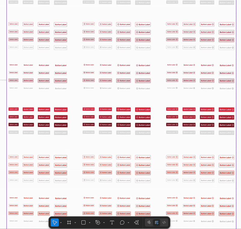
It seemed comprehensive at first, just a simple frame with a label. Maybe an icon. Maybe two. Then came sizes. Colors. States. Icon alignments. Theme modes. Before I knew it, my tidy component panel had morphed into a scrollable mess of 432 button variants.
It was chaos… but it was my chaos.
Setting the scene
Edifire UI started as a personal project, to build a scalable, visually balanced design system I could reuse across side projects and eventually release for others to use. I wanted it to be minimal, flexible, and fully tokenized.
The button, being the most frequently used component in any UI kit, was naturally one of the first elements I tackled. I approached it with a mindset of “account for everything.” And that’s exactly what I did. I over-accounted.
When it broke: When Flexibility Becomes Fatigue
This wasn’t a visual failure. Nothing was broken, misaligned, or technically wrong. But something felt heavy. My build-up felt bloated.
I wasn’t getting error messages. I wasn’t struggling to make the component work. What I was struggling with was the mental load of navigating it. I had unknowingly recreated one of the most common and least discussed problems in design systems: Variant Overload.
In Figma, the component panel had become a scroll-fest. Every time I needed a simple button, I found myself buried in nested menus and 5-syllable variant names. It was like trying to order a coffee and being handed a menu with 400+ combinations, each with a slightly different name.
Even though Figma handled it just fine, I wasn’t. The bigger insight? Component overload is a quiet killer in many design systems.
The inspiration
I came across a talk by the Uber design systems team. They were walking through how they reduced their badge component from dozens of rigid variants to just a few highly dynamic configurations, by switching to a parametric design model.
Their badge could take on any shape, tone, or status, without bloating the variant list. It used just a handful of props like tone, size, icon, and message, powered by tokens and context-aware logic. It was simple, smart, and scalable.
This stuck with me.
So when I looked back at my own button, I began to see it not as a static set of visual options, but as a parametric system waiting to be unlocked. That mindset that shift from how it looks to how it behaves, became the catalyst for rethinking everything.
Inspired by Uber’s “Parametric Components” approach
Watch here: https://youtu.be/-z9JX8Lz5lI?si=9l5XZCbpWZF0OQee
In this talk, Uber shares how they reduced the badge component by switching from permutations to parametric controls using tokens and props.
The Audit: Mapping the Mess
I took a step back and mapped every possible combination I had created.
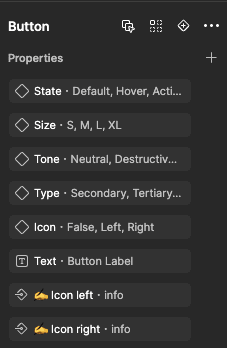
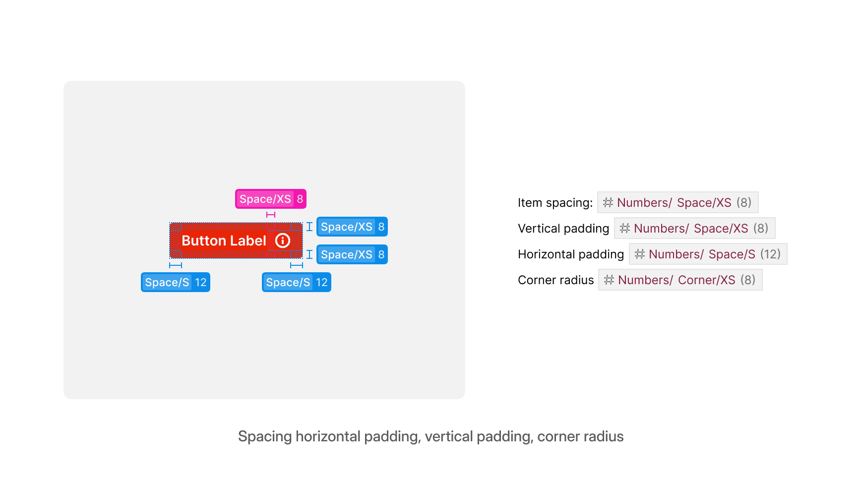
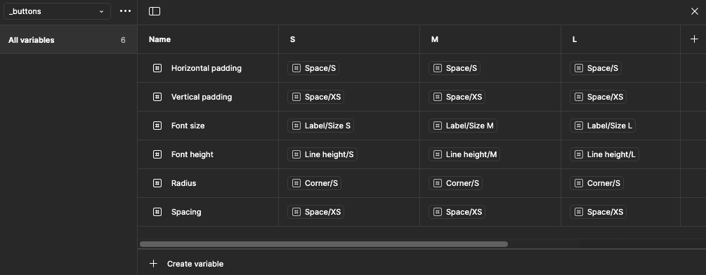
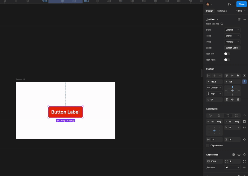
What i did was to map out the anatomy of the buttons including its different sizes, so i can identify what property to turn into a parametric variable.
I tracked the following elements:

The Rebuild
This time i approached the button like a developer might approach a component API.
I then broke down the visual and functional aspects into properties that could be toggled and scaled. I created a collection of token variables for the identified properties and then assigned the variables to the button component while maintaining both light and dark mode.
Instead of hundreds of rigid variants, I created one core structure with 32 intelligent configurations. Each decision was driven by 2 questions:
"Will this scale without duplication?"
“Will this reduce mental load for anyone using it, including future me?”
The Outcome: From Bloat to Brilliance
Reducing 432 variants to 32 wasn’t just about decluttering. It created space—for speed, focus, and consistency.
Now when I need a button, I toggle a few properties. That’s it. No overly long list of variants and properties, No visual/mental fatigue.

What I Learned
Working alone on Edifire gave me full control, but also full responsibility. I couldn’t rely on team reviews or shared standards. The system had to be resilient by design.
Here’s what this process taught me:
What's next
The button refactor was just the first step in shaping Edifire into a system that’s thoughtful, scalable, and genuinely enjoyable to use.
Next, I’m applying the same approach to modals, dropdowns, tabs, and inputs, where logic not layering, leads the design.
Edifire is going open source soon. When it does, it won’t just be a collection of UI parts. Build small. Think in systems. Reduce friction. Leave room to grow.
I’m also focused on bridging the gap between design and development so others can use the system right out of the box. I plan to include the React code snippets of the components in Edifire UI directly on the file using Figma MCP and Cursor.